onboarding_overlay 3.0.0-pre.4  onboarding_overlay: ^3.0.0-pre.4 copied to clipboard
Flexible to control Onboarding overlay with or without target element (fork from onboard_overlay)

onboarding_overlay #
A flexible onboarding widget that can start and stop with an arbitrary number of steps and arbitrary starting point
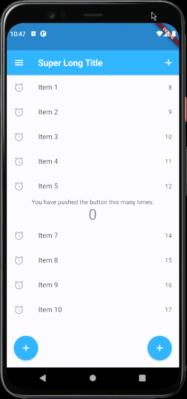
Demo #
Usage #
- Create your
List<FocusNodes>somewhere accessible
final List<FocusNode> overlayKeys = <FocusNode>[
    FocusNode(),
    FocusNode(),
    FocusNode(),
  ];
- Create your
List<OnboardingSteps>somewhere accessible
final List<OnboardingSteps> steps = [OnboardingStep(
    focusNode: _focusNodes != null ? _focusNodes[0] : null,
    title: "Hi",
    titleTextStyle: Theme.of(context).textTheme.headline5.copyWith(
        color: Theme.of(context).canvasColor,
        ),
    bodyText:
        '''Check this out''',
    bodyTextStyle: Theme.of(context).textTheme.subtitle1.copyWith(
        color: Theme.of(context).canvasColor,
        ),
    hasLabelBox: false,
    fullscreen: true,
    overlayColor: Theme.of(context).primaryColorDark.withOpacity(0.8),
    hasArrow: false,
    ),]
- Provide the
FocusNodes to the widgets.
Focus(
    focusNode: focusNode[0]
    Text(
        'You have pushed the button this many times:',
    ),
)
- Add Onboarding widget to your widget tree below MaterialWidget and above of everything else
void main() {
  runApp(App());
}

class App extends StatefulWidget {
  final GlobalKey<OnboardingState> onboardingKey = GlobalKey<OnboardingState>();

  @override
  _AppState createState() => _AppState();
}

class _AppState extends State<App> {
  List<FocusNode> focusNodes = <FocusNode>[];

  @override
  void initState() {
    super.initState();

    focusNodes = List<FocusNode>.generate(
      7,
      (int i) => FocusNode(debugLabel: i.toString()),
      growable: false,
    );
  }

  @override
  Widget build(BuildContext context) => MaterialApp(
        home: Onboarding(
          key: widget.onboardingKey,
          steps: steps,
          onChanged: (int index) {
            debugPrint('----index $index');
            if (index == 5) {
              /// interrupt onboarding on specific step
              /// widget.onboardingKey.currentState.hide();
              /// or do something else
            }
          },
          child: Home(
            focusNodes: focusNodes,
          ),
        ),
      );
}
- Showing the onboarding
- On some activity somewhere down the widget tree in another widget with a new BuildContext
final OnboardingState? onboarding = Onboarding.of(context);

if (onboarding != null) {
  onboarding.show();
}
- Or immediately in initState somewhere down the widget tree in another widget with a new BuildContext
@override
void initState() {
  super.initState();
  WidgetsBinding.instance.addPostFrameCallback((Duration timeStamp) {
    final OnboardingState? onboarding = Onboarding.of(context);
    if (onboarding != null) {
      onboarding.show();
    }
  });
}
-
The text can be wrapped in a box, than support all kind of decorations and only shape: BoxShape.rectangle For this to happen, you have to set
hasLabelBoxequal totrue,labelBoxDecoration, which supports onlyBoxDecoration -
The Label box also supports having an arrow. This is controlled by
hasArrow. The position is not calculated automatically. The default position is top. You will have to specify the position via arrowPosition by using the enumArrowPosition. TheArrowPosition.topandArrowPosition.bottomcalculates the horizontal position automatically according to the widget of interest (the focused one which is visible through the overlay), the other arrow positions are centered in the label box e.g.ArrowPosition.topCenter,ArrowPosition.bottomCenter. In addition there are 2 new settings from v3.0.0 -ArrowPosition.autoVerticalandArrowPosition.autoVerticalCenter, which will take care of positioning the arrow automatically relative to the label box and widget position. -
The onboarding also supports forwarding the onTap event to the widget of interest. You can control the behavior for each step using the overlayBehavior. It accepts the Flutter enum HitTestBehavior. By default, the value used is
HitTestBehavior.opaque.
HitTestBehavior.opaqueblocks the onTap on the widget and will trigger the onTap only on the overlayHitTestBehavior.translucenttriggers onTap callbacks on the widget and on the overlayHitTestBehavior.deferToChildtriggers only the onTap on the widget
-
Sometimes the title and the bodyText might not fit well in the constrained label box, because of the long texts, longer translations or smaller screens. There are 2 behaviors for this scenario. The default one will limit the title to 2 lines and the bodyText to 5 lines and will overflow both with ellipsis, the second one is to automatically resize the texts. This is controlled by the Onboarding property
autoSizeTexts, which default value isfalse. -
The onboarding can show only a portion of the defined steps with a specific start index. Use
showWithStepsmethod. Remember that the steps indexes are 0-based (starting from zero)
@override
void initState() {
  super.initState();
  WidgetsBinding.instance.addPostFrameCallback((Duration timeStamp) {
    final OnboardingState? onboarding = Onboarding.of(context);
    if (onboarding != null) {
      onboarding.showWithSteps(3, <int>[3,4,5,6]);
    }
  });
  }
- The onboarding can start from a specific index and play until the end step is reached. Use
showFromIndexmethod. Remember that the steps indexes are 0-based (starting from zero)
  @override
  void initState() {
    super.initState();
    WidgetsBinding.instance.addPostFrameCallback((Duration timeStamp) {
      final OnboardingState? onboarding = Onboarding.of(context);
      if (onboarding != null) {
        onboarding.showFromIndex(3);
      }
    });
  }
- From v.3.0.0 if you want to show something else, different from just title and explanation text, then
stepBuilderis for you. With stepBuilder, you can change the layout, add images or something else. With the combination ofmanualControlyou can even add you own buttons to proceed to next step and interrupt the onboarding.
OnboardingStep(
  focusNode: focusNodes[0],
  titleText: 'Tap anywhere to continue ',
  titleTextColor: Colors.black,
  bodyText: 'Tap anywhere to continue Tap anywhere to continue',
  labelBoxPadding: const EdgeInsets.all(16.0),
  labelBoxDecoration: BoxDecoration(
    shape: BoxShape.rectangle,
    borderRadius: const BorderRadius.all(Radius.circular(8.0)),
    color: const Color(0xFF00E1FF),
    border: Border.all(
      color: const Color(0xFF1E05FB),
      width: 1.0,
      style: BorderStyle.solid,
    ),
  ),
  arrowPosition: ArrowPosition.autoVertical,
  hasArrow: true,
  hasLabelBox: true,
  fullscreen: true,
  manualControl: true,
  stepBuilder: (
    BuildContext context,
    OnboardingStepRenderInfo renderInfo,
  ) {
    return SingleChildScrollView(
      child: Column(
        children: [
          Text(
            renderInfo.titleText,
            style: renderInfo.titleStyle,
          ),
          Row(
            crossAxisAlignment: CrossAxisAlignment.start,
            children: [
              Image.asset(
                'assets/demo.gif',
                width: 50,
              ),
              const SizedBox(
                width: 10,
              ),
              Flexible(
                child: AutoSizeText(
                  renderInfo.bodyText,
                  style: renderInfo.bodyStyle,
                ),
              ),
            ],
          ),
          Row(
            children: [
              TextButton(
                onPressed: renderInfo.nextStep,
                child: Text('Next'),
              ),
              TextButton(
                onPressed: renderInfo.close,
                child: Text('close'),
              ),
            ],
          ),
        ],
      ),
    );
  },
),
- From v3.0.0 there is an additional OverlayController (ChangeNotifier) attached to the OverlayState that provides the currentIndex, currentStep and isVisible.
final OnboardingState? onboarding = Onboarding.of(context);
if( onboarding?.controller.isVisible ?? false) {
  // do some logic here
}
-
From v.3.0.0 you can also add a pulsing animation around the focused widget. Pulse animation will be displayed if the
overlayBehaviorisHitTestBehavior.deferToChildorHitTestBehavior.translucentandshowPulseAnimationon anOnboardingStepis set totrue. In addition you can change the inner and outer colors of the pulse animation. Thanks to the author Gautier of the pal package for the inspiration. -
From v.3.0.0 you can show a red border around the label box for debugging purposes by using an
OnboardingparameterdebugBoundarieswhich isfalseby default.
Metadata
Publisher
unverified uploader
Metadata
Flexible to control Onboarding overlay with or without target element (fork from onboard_overlay)
Repository (GitHub)
View/report issues
License
 unknown (LICENSE)
Dependencies
auto_size_text, flutter, vector_math