tencent_cloud_chat 1.1.2  tencent_cloud_chat: ^1.1.2 copied to clipboard
 comm.qq.com
Tencent Cloud Chat UIKit base package offers a foundation for building feature-rich, customizable chat applications and integrating Modular UI Component Packages.
Tencent Cloud Chat UIKit V2 #
Welcome to the brand new Flutter Chat UIKit V2 developed by Tencent Cloud Chat. We're excited to introduce this completely redesigned and redeveloped toolkit, built from the ground up, two years after the release of our previous version, tencent_cloud_chat_uikit (named tim_ui_kit previously).
Our new Flutter Chat UIKit is designed to provide developers with a comprehensive set of tools to create feature-rich chat applications with ease.
It is built with a modular approach, allowing you to pick and choose the components you need while keeping your application lightweight and efficient.
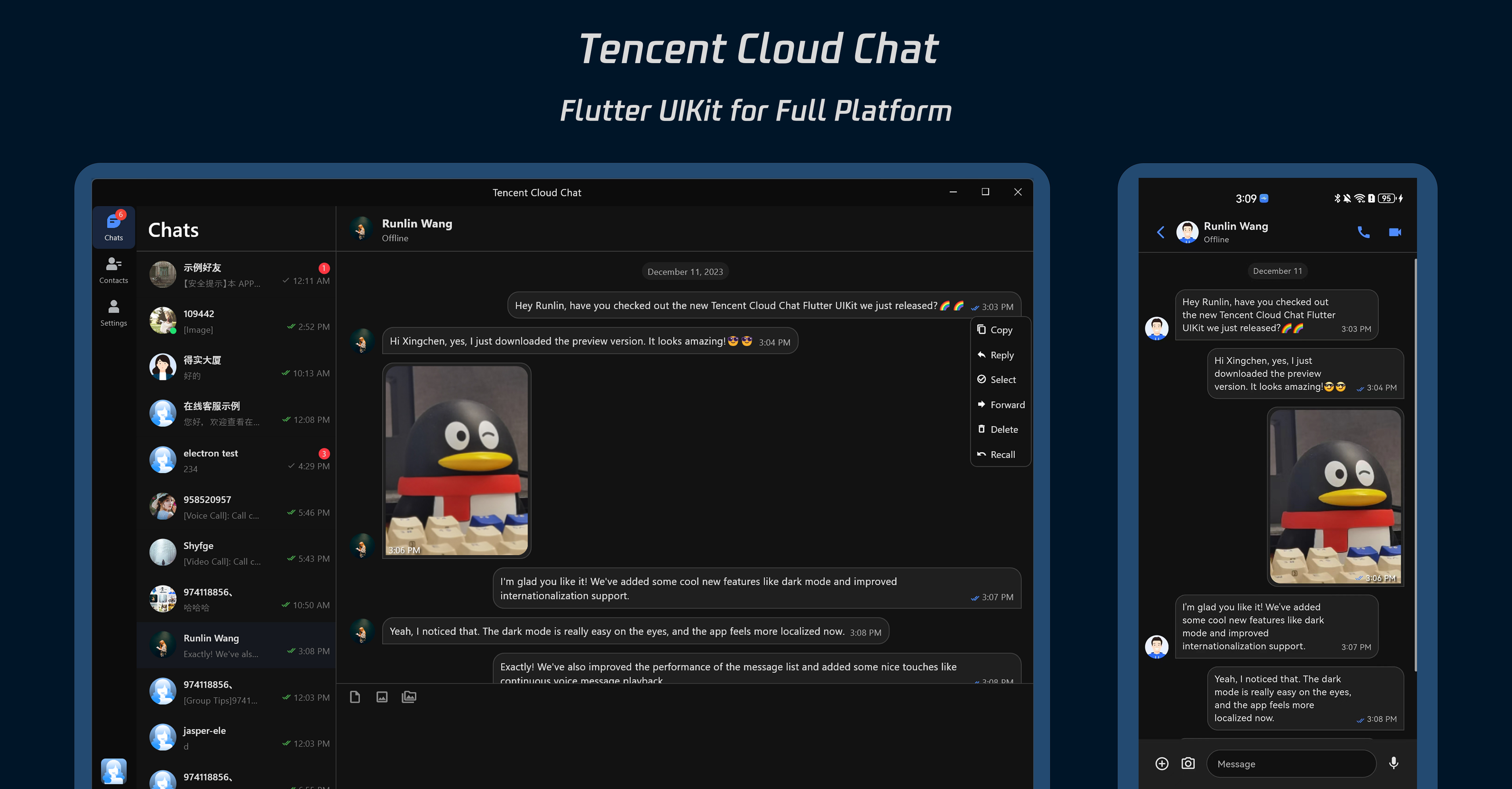
The UIKit includes a wide range of capabilities, such as Conversation List, Message handling, Contact lists, User and Group Profiles, Search functionality, and more.
Features #
-
Theme Customization: Switch between light and dark mode on the fly, or customize your own theme with our rich set of options.
-
Internationalization: We've added support for more languages including Arabic, and introduced a Middle Eastern UI. Our powerful and user-friendly localization tools make it easier than ever to customize the localization configuration and the translation, and provide a localized user experience.
-
Performance Enhancements: We've made significant improvements to the performance of the message list, and introduced efficient and precise message positioning capabilities.
-
Multimedia Support: Experience improved multimedia and file message handling, with continuous playback for voice messages and swipeable multimedia message previews.
-
Detail Optimizations: We've added numerous detail optimizations including rich animations, haptic feedback, and refined interfaces to enhance the user experience.
-
New Features: Enjoy new features like a grid-style avatar, redesigned forwarding panel, group member selector, and a new message long-press menu.
-
Modular Packages: Components are broken down into modular packages, allowing for on-demand imports and reducing unnecessary bloat. Each modular package supports built-in navigation. For instance, you can automatically navigate from a Conversation to a Message to start a chat, without the need to manually instantiate multiple pages and handle the transitions yourself. This greatly simplifies the complexity of development and integration.
-
Developer-friendly Design: We've introduced a more unified, standardized component parameter design, clearer code naming, and more detailed comments to make development easier and more efficient.
We're excited for you to try out our new Flutter Chat UIKit and look forward to seeing the amazing applications you'll create with it!
Compatibility #
Our UIKit supports both mobile and desktop UI styles, and is compatible with Android, iOS, macOS, Windows, and Web (support coming in future versions).
It comes with built-in support for English, Simplified Chinese, Traditional Chinese, Japanese, Korean, and Arabic languages (with support for Arabic RTL interface), and light and dark appearance styles.
Requirements #
- Flutter version: 3.10 or above
- Dart version: 3.0 or above
Getting Started #
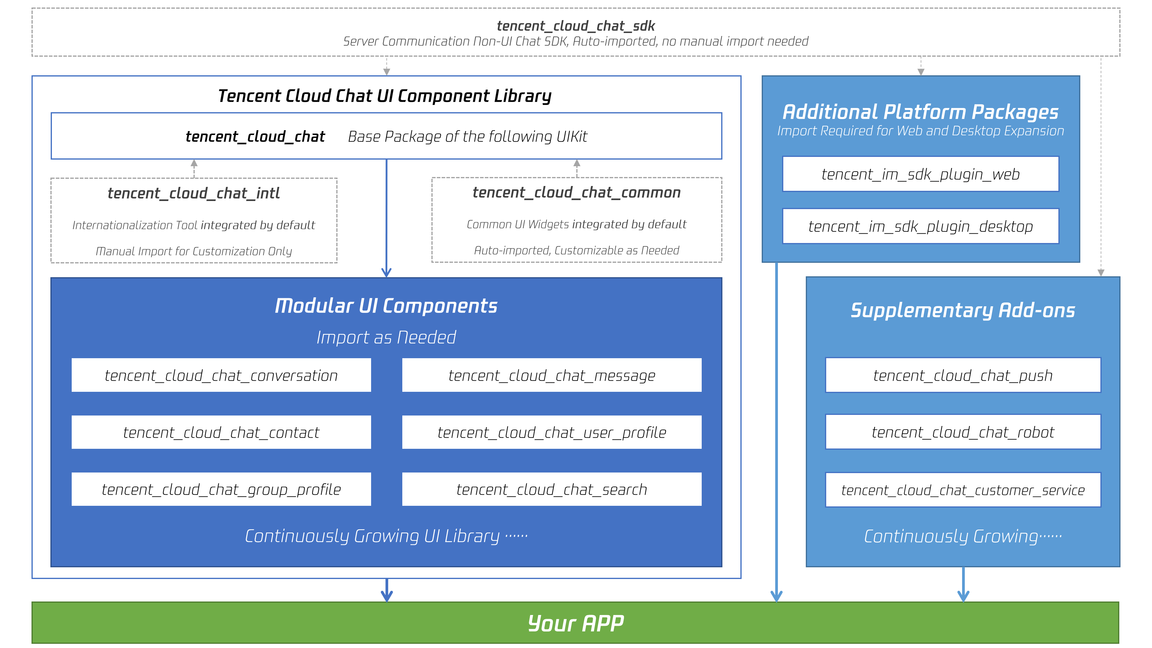
To start using our UIKit, first import the base package, tencent_cloud_chat.
Next, import the required UI component packages that suit your needs from the following list:
- tencent_cloud_chat_message
- tencent_cloud_chat_conversation
- tencent_cloud_chat_contact
- tencent_cloud_chat_user_profile (Coming Soon)
- tencent_cloud_chat_group_profile (Coming Soon)
- tencent_cloud_chat_group_search (Coming Soon)
The architecture of our UIKit is shown below:
Basic Usage #
Before you start using each Modular Package UI component, there are some initial setup steps you need to follow in your project.
-
Prepare the necessary Tencent Cloud Chat configuration information, such as sdkappid, test userID, userSig, etc. You can refer to this document: https://www.tencentcloud.com/document/product/1047/45907#.E5.89.8D.E5.BA.8F.E5.B7.A5.E4.BD.9C
-
In your Flutter project, install the main package and the optional Modular Packages mentioned in the Getting Started section above.
-
Import
TencentCloudChatMaterialApp:
Replace your project's MaterialApp with TencentCloudChatMaterialApp. This will automatically manage and configure the language, theme (with material3), themeMode, and other settings, ensuring that the UIKit's interface parameters are consistent with your project.
This step will take over the language, theme, and themeMode configuration of your project. If you do not want us to automatically manage all these configurations for your project, you can open TencentCloudChatMaterialApp, check its source code and implementation, and manually import the necessary capabilities in your project's MaterialApp.
- Initialization and Login:
Call the TencentCloudChat.controller.initUIKit method to initialize and log in. The call instructions and reference code are as follows:
    await TencentCloudChat.controller.initUIKit(
      context: context,
      config: TencentCloudChatConfig(
        usedComponentsRegister: [
          TencentCloudChatConversationInstance.register,
          TencentCloudChatMessageInstance.register,
          /// The above registers are examples.
          /// In this field, pass in the register of each sub Modular UI Package.
          /// After installing each sub Modular UI Package, you need to declare it here before you can use it.
        ],
        preloadDataConfig: TencentCloudChatInitDataConfig(
        /// Config related to preloading data, used to improve performance
        ),
        userConfig: TencentCloudChatUserConfig(
        /// Config related to the user
        ),
      ),
      options: TencentCloudChatInitOptions(
        sdkAppID: , /// The SDKAppID of your Tencent Cloud Chat application
        userID: , /// The userID of the logged-in user
        userSig: , /// The userSig of the logged-in user
        sdkListener: V2TimSDKListener(),  /// Event listener registered with the Chat SDK
      ),
      plugins: [],  /// Used plugins, such as tencent_cloud_chat_robot, etc. For specific usage, please refer to the README of each plugin.
    );
Once you have completed the basic integration process of the UIKit, you can proceed to explore the READMEs of each Modular Package to complete the integration of the individual UI components.
This will help you understand the specific usage and customization options for each component, allowing you to create a tailored chat application that meets your requirements.
Common Usage of Each Modular Package #
Each Modular UI Component Package has five unified input parameters that offer a high degree of customization and control over the components. These parameters are:
- options: Component-specific essential parameters that enable the proper functioning of the component. For instance, the Message component requires conversation information. Some generic components might not need this parameter.
- config: A set of component-specific configurations that allow for fine-grained customization. For example, the Message component's attachment area configuration can be adjusted to suit your application's needs.
- builders: A collection of widget building methods within the component, enabling external UI customization. To streamline UI development, each builder comes with the required parameters and methods, making data and logic layer methods readily available for use. For example, the
messageInputBuilderin the Message component exposes various parameters such as methods for sending different types of message, current conversation details, group member lists, and more. - eventHandlers: Callbacks for handling component events, primarily including
onTapclick events and lifeCycle events. These handlers allow you to define custom behavior in response to user interactions and component lifecycle changes. - controller: A set of control methods related to the component, providing additional functionality and control over its behavior. For example, the Message component's
scrollToBottommethod enables scrolling the message list to the bottom.
Understanding these parameters will help you effectively utilize and customize the various Modular UI Component Packages, allowing you to create a tailored chat application that meets your specific requirements.
Advanced Usage #
Additional Methods in TencentCloudChat.controller #
In the Basic Usage section above, we explained how to initialize the UIKit and log in using the TencentCloudChat.controller.
This controller also contains several other methods that can be used to control some global aspects of the UIKit. For example:
- toggleBrightnessMode: This method allows you to switch between dark and light modes.
- getThemeData: This method returns the built-in theme configuration in the form of a material3 ThemeData class. This can be used to configure the
themeparameter for yourMaterialApp, ensuring that our UIKit and the other components of your project have a consistent appearance. - setThemeColors: This method allows you to customize the color configurations for both dark and light modes in the UIKit. This ensures that our UIKit and the other components of your project have a consistent appearance. The configurations set by this method will take effect across all our UI components.
- setBrightnessMode: This method allows you to set the current Brightness Mode.
For more methods and their descriptions, please refer to the annotations for each method. This allows you to have more control over the behavior and appearance of the UIKit, enabling you to fine-tune it to perfectly fit the needs of your project.
Using Our Provided Common Components #
Our components are designed to automatically adapt to both mobile and desktop environments.
To facilitate development and maintain UI consistency, we have made all our internal common components available for you to use.
For example:
- TencentCloudChatAvatar: Avatar component
- TencentCloudChatOperationBar: Configurable operation bar component
And more.
We also provide some desktop-specific components designed for desktop interactions, for example:
- TencentCloudChatDesktopPopup.showColumnMenu: Vertical menu component, typically used for context menus.
- TencentCloudChatDesktopPopup.showSecondaryConfirmDialog: Secondary confirmation dialog component, for example, to confirm whether a user wants to delete a message.
- TencentCloudChatDesktopPopup.showPopupWindow: Displays a movable modal component.
- TencentCloudChatDesktopPopup.showMedia: Full-screen media preview component for images, videos, etc.
- TencentCloudChatDragArea: Desktop component drag area.
And more.
For the specific usage of these common components, please refer to the README of the tencent_cloud_chat_common package.
Developing Adaptive Widgets for Different Screens and Platforms #
To facilitate the development of cross-platform applications with a single codebase, including mobile, desktop, and Web, we have made our built-in adaptive widget solution available for you to use.
Simply change the State your component inherits from to TencentCloudChatState, and you can use the various adaptive capabilities we provide.
You can override different builders for different platform environments, such as defaultBuilder, desktopBuilder, webBuilder, etc. Use them as needed based on the provided prompts.
Additionally, this class provides screen adaptation methods like getWidth, getHeight, getSquareSize, getFontSize, etc., which you can use directly.
Conclusion #
We hope that this documentation will help you understand the power and flexibility of our new Flutter Chat UIKit. With its modular design and a wide range of customizable options, it provides a comprehensive solution for building chat applications. Its advanced features, such as Conversation management, Message handling, and built-in navigation transitions, make it a robust tool for developers.
We look forward to seeing the amazing applications you will create with our UIKit. If you have any questions or need further information, feel free to reach out.
Metadata
Publisher
Metadata
Tencent Cloud Chat UIKit base package offers a foundation for building feature-rich, customizable chat applications and integrating Modular UI Component Packages.
Homepage
Repository (GitHub)
View/report issues
License
 unknown (LICENSE)
Dependencies
audioplayers, collection, exif, flutter, flutter_ringtone_player, flutter_screenutil, hive, hive_flutter, path, path_provider, tencent_cloud_chat_intl, tencent_cloud_chat_sdk, tencent_cloud_uikit_core