ToggleSwitch class
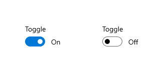
The toggle switch represents a physical switch that allows users to turn things on or off, like a light switch. Use toggle switch controls to present users with two mutually exclusive options (such as on/off), where choosing an option provides immediate results.
Use a toggle switch for binary operations that take effect right after the user flips the toggle switch
Think of the toggle switch as a physical power switch for a device: you flip it on or off when you want to enable or disable the action performed by the device.
See also:
- Checkbox, which let the user select multiple items from a collection of two or more items
- ToggleButton, which let the user toggle a option on or off
- RadioButton, which let the user select one item from a collection of two or more options
- docs.microsoft.com/en-us/windows/apps/design/controls/toggles
- Inheritance
-
- Object
- DiagnosticableTree
- Widget
- StatefulWidget
- ToggleSwitch
- Available Extensions
Constructors
-
ToggleSwitch({Key? key, required bool checked, required ValueChanged<
bool> ? onChanged, ToggleSwitchThemeData? style, Widget? content, bool leadingContent = false, String? semanticLabel, Widget? knob, ToggleSwitchKnobBuilder? knobBuilder, FocusNode? focusNode, bool autofocus = false}) -
Creates a toggle switch.
const
Properties
- autofocus → bool
-
True if this widget will be selected as the initial focus when no other
node in its scope is currently focused.
final
- checked → bool
-
Whether this toggle switch is checked
final
- content → Widget?
-
The content of the radio button.
final
- focusNode → FocusNode?
-
An optional focus node to use as the focus node for this widget.
final
- hashCode → int
-
The hash code for this object.
no setterinherited
- key → Key?
-
Controls how one widget replaces another widget in the tree.
finalinherited
- knob → Widget?
-
The knob of the switch
final
- knobBuilder → ToggleSwitchKnobBuilder?
-
Build the knob of the switch based on the current state
final
- leadingContent → bool
-
Whether to position content before the switch, if provided
final
-
onChanged
→ ValueChanged<
bool> ? -
Called when the value of the switch should change.
final
- runtimeType → Type
-
A representation of the runtime type of the object.
no setterinherited
- semanticLabel → String?
-
Semantic label for the input.
final
- style → ToggleSwitchThemeData?
-
The style of the toggle switch
final
Methods
-
createElement(
) → StatefulElement -
Creates a StatefulElement to manage this widget's location in the tree.
inherited
-
createState(
) → State< ToggleSwitch> -
Creates the mutable state for this widget at a given location in the tree.
override
-
debugDescribeChildren(
) → List< DiagnosticsNode> -
Returns a list of
DiagnosticsNodeobjects describing this node's children.inherited -
debugFillProperties(
DiagnosticPropertiesBuilder properties) → void -
Add additional properties associated with the node.
override
-
noSuchMethod(
Invocation invocation) → dynamic -
Invoked when a nonexistent method or property is accessed.
inherited
-
toDiagnosticsNode(
{String? name, DiagnosticsTreeStyle? style}) → DiagnosticsNode -
Returns a debug representation of the object that is used by debugging
tools and by DiagnosticsNode.toStringDeep.
inherited
-
toString(
{DiagnosticLevel minLevel = DiagnosticLevel.info}) → String -
A string representation of this object.
inherited
-
toStringDeep(
{String prefixLineOne = '', String? prefixOtherLines, DiagnosticLevel minLevel = DiagnosticLevel.debug}) → String -
Returns a string representation of this node and its descendants.
inherited
-
toStringShallow(
{String joiner = ', ', DiagnosticLevel minLevel = DiagnosticLevel.debug}) → String -
Returns a one-line detailed description of the object.
inherited
-
toStringShort(
) → String -
A short, textual description of this widget.
inherited
Operators
-
operator ==(
Object other) → bool -
The equality operator.
inherited