Tooltip class
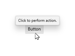
A tooltip is a popup that contains additional information about another control or object. Tooltips display automatically when the user moves focus to, presses and holds, or hovers the pointer over the associated control. The tooltip disappears when the user moves focus from, stops pressing on, or stops hovering the pointer over the associated control (unless the pointer is moving towards the tooltip).
See also:
- Flyout, which creates a popup with interactive content
- Inheritance
-
- Object
- DiagnosticableTree
- Widget
- StatefulWidget
- Tooltip
- Available Extensions
Constructors
- Tooltip({Key? key, String? message, InlineSpan? richMessage, Widget? child, TooltipThemeData? style, bool excludeFromSemantics = false, bool useMousePosition = true, bool displayHorizontally = false, TooltipTriggerMode? triggerMode, bool? enableFeedback})
-
Creates a tooltip.
const
Properties
- child → Widget?
-
The widget the tooltip will be displayed, either above or below,
when the mouse is hovering or whenever it gets long pressed.
final
- displayHorizontally → bool
-
Whether the tooltip should be displayed at the left or right of
the child. If true, TooltipThemeData.preferBelow is used as
"preferLeft"
final
- enableFeedback → bool?
-
Whether the tooltip should provide acoustic and/or haptic feedback.
final
- excludeFromSemantics → bool
-
Whether the tooltip's message should be excluded from the
semantics tree.
final
- hashCode → int
-
The hash code for this object.
no setterinherited
- key → Key?
-
Controls how one widget replaces another widget in the tree.
finalinherited
- message → String?
-
The text to display in the tooltip.
final
- richMessage → InlineSpan?
-
The rich text to display in the tooltip.
final
- runtimeType → Type
-
A representation of the runtime type of the object.
no setterinherited
- style → TooltipThemeData?
-
The style of the tooltip. If non-null, it's mescled with
FluentThemeData.tooltipThemeDatafinal - triggerMode → TooltipTriggerMode?
-
The TooltipTriggerMode that will show the tooltip.
final
- useMousePosition → bool
-
Whether the current mouse position should be used to render the
tooltip on the screen. If no mouse is connected, this value is
ignored.
final
Methods
-
createElement(
) → StatefulElement -
Creates a StatefulElement to manage this widget's location in the tree.
inherited
-
createState(
) → State< Tooltip> -
Creates the mutable state for this widget at a given location in the tree.
override
-
debugDescribeChildren(
) → List< DiagnosticsNode> -
Returns a list of
DiagnosticsNodeobjects describing this node's children.inherited -
debugFillProperties(
DiagnosticPropertiesBuilder properties) → void -
Add additional properties associated with the node.
override
-
noSuchMethod(
Invocation invocation) → dynamic -
Invoked when a nonexistent method or property is accessed.
inherited
-
toDiagnosticsNode(
{String? name, DiagnosticsTreeStyle? style}) → DiagnosticsNode -
Returns a debug representation of the object that is used by debugging
tools and by DiagnosticsNode.toStringDeep.
inherited
-
toString(
{DiagnosticLevel minLevel = DiagnosticLevel.info}) → String -
A string representation of this object.
inherited
-
toStringDeep(
{String prefixLineOne = '', String? prefixOtherLines, DiagnosticLevel minLevel = DiagnosticLevel.debug}) → String -
Returns a string representation of this node and its descendants.
inherited
-
toStringShallow(
{String joiner = ', ', DiagnosticLevel minLevel = DiagnosticLevel.debug}) → String -
Returns a one-line detailed description of the object.
inherited
-
toStringShort(
) → String -
A short, textual description of this widget.
inherited
Operators
-
operator ==(
Object other) → bool -
The equality operator.
inherited
Static Methods
-
dismissAllToolTips(
) → bool - Dismiss all of the tooltips that are currently shown on the screen.