ComboBox<T> class
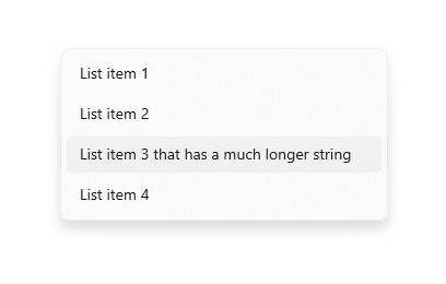
A fluent design button for selecting from a list of items.
A combo box button lets the user select from a number of items. The button shows the currently selected item as well as an arrow that opens a menu for selecting another item.
The type T is the type of the value that each combo box item represents.
All the entries in a given menu must represent values with consistent types.
Typically, an enum is used. Each ComboBoxItem in items must be
specialized with that same type argument.
The onChanged callback should update a state variable that defines the combo box's value. It should also call State.setState to rebuild the combo box with the new value.
If the onChanged callback is null or the list of items is null then the combo box button will be disabled, i.e. its arrow will be displayed in grey and it will not respond to input. A disabled button will display the disabledPlaceholder widget if it is non-null. However, if disabledPlaceholder is null and placeholder is non-null, the placeholder widget will instead be displayed.
Requires one of its ancestors to be a Material widget.
See also:
- ComboBoxItem, the class used to represent the items.
- docs.microsoft.com/en-us/windows/apps/design/controls/combo-box
- Inheritance
-
- Object
- DiagnosticableTree
- Widget
- StatefulWidget
- ComboBox
- Implementers
- Available Extensions
Constructors
-
ComboBox({Key? key, required List<
ComboBoxItem< ? items, ComboBoxBuilder? selectedItemBuilder, T? value, Widget? placeholder, Widget? disabledPlaceholder, ValueChanged<T> >T?> ? onChanged, VoidCallback? onTap, int elevation = 8, TextStyle? style, Widget icon = const Icon(FluentIcons.chevron_down), Color? iconDisabledColor, Color? iconEnabledColor, double iconSize = 8.0, bool isExpanded = false, Color? focusColor, FocusNode? focusNode, bool autofocus = false, Color? popupColor}) -
Creates a combo box button.
const
Properties
- autofocus → bool
-
True if this widget will be selected as the initial focus when no other
node in its scope is currently focused.
final
- disabledPlaceholder → Widget?
-
A preferred placeholder widget that is displayed when the combo box is disabled.
final
- elevation → int
-
The z-coordinate at which to place the menu when open.
final
- focusColor → Color?
-
The color for the button's Material when it has the input focus.
final
- focusNode → FocusNode?
-
An optional focus node to use as the focus node for this widget.
final
- hashCode → int
-
The hash code for this object.
no setterinherited
- icon → Widget
-
The widget to use for the comobo box button's icon.
final
- iconDisabledColor → Color?
-
The color of any Icon descendant of icon if this button is disabled,
i.e. if onChanged is null.
final
- iconEnabledColor → Color?
-
The color of any Icon descendant of icon if this button is enabled,
i.e. if onChanged is defined.
final
- iconSize → double
-
The size to use for the checkbox button's down arrow icon button.
final
- isExpanded → bool
-
Set the combo box's inner contents to horizontally fill its parent.
final
-
items
→ List<
ComboBoxItem< ?T> > -
The list of items the user can select.
final
- key → Key?
-
Controls how one widget replaces another widget in the tree.
finalinherited
-
onChanged
→ ValueChanged<
T?> ? -
Called when the user selects an item.
final
- onTap → VoidCallback?
-
Called when the combo box button is tapped.
final
- placeholder → Widget?
-
A placeholder widget that is displayed by the combo box button.
final
- popupColor → Color?
-
The background color of the combo box menu.
final
- runtimeType → Type
-
A representation of the runtime type of the object.
no setterinherited
- selectedItemBuilder → ComboBoxBuilder?
-
A builder to customize the combo box buttons corresponding to the
ComboBoxItems in items.
final
- style → TextStyle?
-
The text style to use for text in the combo box button and the combo box
menu that appears when you tap the button.
final
- value → T?
-
The value of the currently selected ComboBoxItem.
final
Methods
-
createElement(
) → StatefulElement -
Creates a StatefulElement to manage this widget's location in the tree.
inherited
-
createState(
) → State< ComboBox< T> > -
Creates the mutable state for this widget at a given location in the tree.
override
-
debugDescribeChildren(
) → List< DiagnosticsNode> -
Returns a list of DiagnosticsNode objects describing this node's
children.
inherited
-
debugFillProperties(
DiagnosticPropertiesBuilder properties) → void -
Add additional properties associated with the node.
inherited
-
noSuchMethod(
Invocation invocation) → dynamic -
Invoked when a nonexistent method or property is accessed.
inherited
-
toDiagnosticsNode(
{String? name, DiagnosticsTreeStyle? style}) → DiagnosticsNode -
Returns a debug representation of the object that is used by debugging
tools and by DiagnosticsNode.toStringDeep.
inherited
-
toString(
{DiagnosticLevel minLevel = DiagnosticLevel.info}) → String -
A string representation of this object.
inherited
-
toStringDeep(
{String prefixLineOne = '', String? prefixOtherLines, DiagnosticLevel minLevel = DiagnosticLevel.debug}) → String -
Returns a string representation of this node and its descendants.
inherited
-
toStringShallow(
{String joiner = ', ', DiagnosticLevel minLevel = DiagnosticLevel.debug}) → String -
Returns a one-line detailed description of the object.
inherited
-
toStringShort(
) → String -
A short, textual description of this widget.
inherited
Operators
-
operator ==(
Object other) → bool -
The equality operator.
inherited