flutter_floating_bottom_bar 1.2.0  flutter_floating_bottom_bar: ^1.2.0 copied to clipboard
 hashstudios.dev
A flutter package that allows showing a floating widget that can be used as a tab bar, bottom navigation bar, etc. The widget reacts to scrolling events too.
Floating Bottom Bar
A flutter package which allows to show a floating widget which can be used as a tab bar, bottom navigation bar or anything one can think of. The widget reacts to scrolling events too.


 |
 |
 |
|---|---|---|
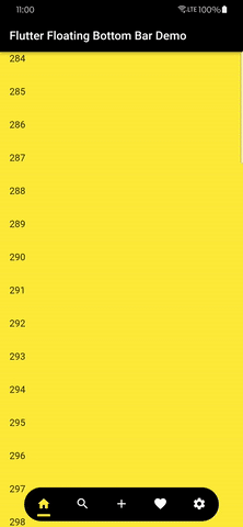
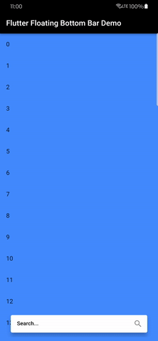
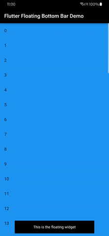
| A floating tab bar | A floating search bar | A basic example |
 |
|---|
| A floating tab bar with a FAB |
Features #
The package allows you to create a floating widget like a bottom navigation bar that reacts to scrolling events.
- It can be used as a tab bar, bottom navigation bar or anything one can think of.
- It reacts to scrolling events too.
- It can be used in a full screen app or in a smaller screen.
Installing #
1. Depend on it #
Add this to your package's pubspec.yaml file:
dependencies:
  flutter-floating-bottom-bar: ^1.2.0
2. Install it #
You can install packages from the command line:
with pub:
pub get
with Flutter:
flutter pub get
3. Import it #
Now in your Dart code, you can use:
import 'package:flutter_floating_bottom_bar/flutter_floating_bottom_bar.dart';
Usage #
BottomBar is a Widget that can be wrapped over any child to convert it into a bottom bar.
Below is the most simple use:
    BottomBar(
          child: Padding(
            padding: const EdgeInsets.all(16.0),
            child: Text(
              "This is the floating widget",
              textAlign: TextAlign.center,
              style: TextStyle(color: Colors.white),
            ),
          ),
          body: (context, controller) =>
              InfiniteListPage(controller: controller, color: Colors.blue,),
    )
It needs two required arguments -
child– This is the child inside theBottomBar(widget which is floating)body– The widget displayed below theBottomBar(like your main app)
Detailed Usage #
Below is the detailed usage of the package, including all properties defined.
BottomBar(
          child: TabBar(), # A floating tab bar
          fit: StackFit.expand,
          icon: (width, height) => Center(
            child: IconButton(
              padding: EdgeInsets.zero,
              onPressed: null,
              icon: Icon(
                Icons.arrow_upward_rounded,
                color: unselectedColor,
                size: width,
              ),
            ),
          ),
          borderRadius: BorderRadius.circular(500),
          duration: Duration(seconds: 1),
          curve: Curves.decelerate,
          showIcon: true,
          width: MediaQuery.of(context).size.width * 0.8,
          barColor: colors[currentPage].computeLuminance() > 0.5 ? Colors.black : Colors.white,
          start: 2,
          end: 0,
          offset: 10,
          barAlignment: Alignment.bottomCenter,
          iconHeight: 35,
          iconWidth: 35,
          reverse: false,
          barDecoration: BoxDecoration(
            color: colors[currentPage],
            borderRadius: BorderRadius.circular(500),
          ),
          iconDecoration: BoxDecoration(
            color: colors[currentPage],
            borderRadius: BorderRadius.circular(500),
          ),
          hideOnScroll: true,
          scrollOpposite: false,
          onBottomBarHidden: () {},
          onBottomBarShown: () {},
          body: (context, controller) => TabBarView(
            controller: tabController,
            dragStartBehavior: DragStartBehavior.down,
            physics: const BouncingScrollPhysics(),
            children: [] # Add children here
          ),
        )
icon #
    icon: Center(
            child: IconButton(
              padding: EdgeInsets.zero,
              onPressed: null,
              icon: Icon(
                Icons.arrow_upward_rounded,
                color: unselectedColor,
              ),
            ),
          ),
This is the scroll to top button. It will be hidden when the BottomBar is scrolled up. It will be shown when the BottomBar is scrolled down. Clicking it will scroll the bar on top.
You can hide this by using the showIcon property.
iconWidth #
iconWidth: 35,
The width of the scroll to top button.
iconHeight #
iconHeight: 35,
The height of the scroll to top button.
barColor #
barColor: Colors.white,
The color of the BottomBar.
end #
end: 0,
The end position in y-axis of the SlideTransition of the BottomBar.
start #
start: 2,
The start position in y-axis of the SlideTransition of the BottomBar.
offset #
offset: 10,
The padding/offset from all sides of the bar in double.
duration #
duration: Duration(seconds: 1),
The duration of the SlideTransition of the BottomBar.
curve #
curve: Curves.decelerate,
The curve of the SlideTransition of the BottomBar.
width #
width: MediaQuery.of(context).size.width * 0.8,
The width of the BottomBar.
borderRadius #
borderRadius: BorderRadius.circular(500),
The border radius of the BottomBar.
showIcon #
showIcon: true,
If you don't want the scroll to top button to be visible, set this to false.
alignment (deprecated) #
alignment: Alignment.bottomCenter,
The alignment of the Stack in which the BottomBar is placed.
Note - This property is deprecated. Use
barAlignmentinstead.
barAlignment #
barAlignment: Alignment.bottomCenter,
The alignment of the Bar and the icon in the Stack in which the BottomBar is placed.
onBottomBarShown #
onBottomBarShown: () {},
The callback when the BottomBar is shown i.e. on response to scroll events.
onBottomBarHidden #
onBottomBarHidden: () {},
The callback when the BottomBar is hidden i.e. on response to scroll events.
reverse #
reverse: true,
To reverse the direction in which the scroll reacts, i.e. if you want to make the bar visible when you scroll down and hide it when you scroll up, set this to true.
scrollOpposite #
scrollOpposite: true,
To reverse the direction in which the scroll to top button scrolls, i.e. if you want to scroll to bottom, set this to true.
hideOnScroll #
hideOnScroll: false,
If you don't want the bar to be hidden ever, set this to false.
fit #
fit: StackFit.expand,
The fit property of the Stack in which the BottomBar is placed.
clip #
clip: Clip.none,
The clipBehaviour property of the Stack in which the BottomBar is placed.
barDecoration #
     barDecoration: BoxDecoration(
            color: Colors.red,
            borderRadius: BorderRadius.circular(500),
          ),
The BoxDecoration for the BottomBar.
iconDecoration #
     iconDecoration: BoxDecoration(
            color: Colors.white,
            borderRadius: BorderRadius.circular(500),
          ),
The BoxDecoration for the scroll to top icon shown when BottomBar is hidden.
Note - You can find more detailed examples in the
exampledirectory.
Bugs or Requests #
If you encounter any problems feel free to open an issue. If you feel the library is missing a feature, please raise a ticket on GitHub and I'll look into it. Pull request are also welcome.
See Contributing.md.
Metadata
Publisher
Metadata
A flutter package that allows showing a floating widget that can be used as a tab bar, bottom navigation bar, etc. The widget reacts to scrolling events too.
Homepage
Repository (GitHub)
View/report issues
Contributing
Documentation
License
 MIT (LICENSE)